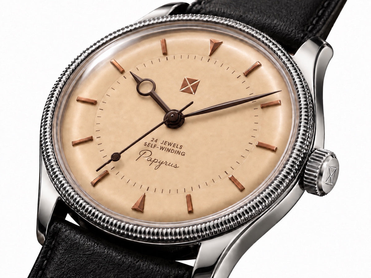
Article: What Does Expensive Watch Finishing Actually Buy?
What Does Expensive Watch Finishing Actually Buy?
Based on finishing notes from October 1, 2026; expanded October 6, 2026.
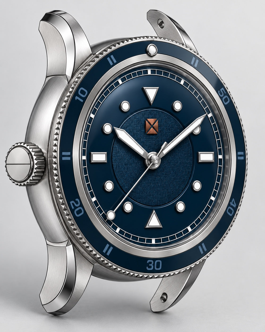
Cover image: Voyager II development render showing the intended brushed surfaces and polished transitions.
One impression keeps bringing me back to this question: the steel on an Omega can feel almost soft to the touch. The surfaces and edges make something familiar feel especially good in the hand.
Looking at my Tandorio and Speedmaster without a loupe, I questioned how much finishing difference I could actually see. That was an informal observation, not a controlled comparison. It made me look more closely at where the difference becomes visible or tangible: surfaces, transitions and the edges you touch every day.
Brightness is only one part of a polished surface
A polished case catches the light readily. That immediate flash can make very different levels of finishing look alike in a small photograph.
To examine it more usefully, move the watch slowly under a broad light source. On a surface intended to be flat, look at how a reflected line travels across it. Does the reflection remain orderly, or appear unexpectedly wavy? On an intentionally curved surface, distortion is part of the shape, so a bent reflection alone proves very little.
The distinction is between the intended geometry and how well the finishing preserves it. Grand Seiko's explanation of Zaratsu polishing is a useful manufacturer example: it connects smooth, distortion-free surfaces with the preservation of defined ridge lines. That illustrates a finishing objective; it does not establish a standard that every watch must imitate.
Brushing has a structure
A brushed surface deserves more attention than a quick decision that it looks matte. Look at the direction, fineness and consistency of the lines. Then follow the finish toward the edge of the surface.
Does it remain controlled around a lug? Does the direction make sense for the shape? On a bracelet, do corresponding surfaces on neighboring links look consistent? Different components may intentionally use different finishes, so consistency means following the design rather than making every surface identical.
Grand Seiko also describes the preparation behind its hairline finishing, including the relationship between the underlying surface and the resulting brushed pattern. It is a useful reminder that an understated finish can involve work you cannot count from a product photograph.
Look where one finish meets another
The boundary between brushing and polishing is often more revealing than either surface by itself. A narrow polished bevel needs to follow the intended form cleanly. Its width should look deliberate as the case turns, and its relationship to the opposite lug should make sense.
Symmetry is useful to inspect where the design calls for symmetry. Intentional asymmetry should be judged on its own terms. The aim is to understand whether the finished object retains the shape its designer meant it to have.
A crisp visual line and a comfortable edge can coexist. The precise treatment of a visible ridge need not be repeated on a corner that presses against the wrist.
Your fingers get information the camera misses
Gently handle the underside of the case, bracelet edges and clasp. Try the crown in the way the seller recommends for that model. Notice whether a surface feels rough, whether an edge catches, and whether the parts you use regularly feel considered.
Keep the categories separate. A smooth clasp surface concerns finishing. The way the clasp closes also involves its geometry, assembly and mechanism. A satisfying watch combines those things, but a pleasing click does not by itself prove excellent surface finishing.
That is what I mean by “soft”: the feel of the edge shape, surface texture and the way parts meet the hand. A comfortable contact edge can be just as rewarding as a polished surface that catches the light.
What a higher price can reasonably lead you to ask
If finishing matters to you, a higher price is a reason to ask for a closer look at the work. It is not proof of how that price was allocated. From the retail figure alone, I cannot separate finishing effort from movement cost, development, distribution, service or the value placed on a name.
Nor would I judge an entire brand from one example. Reference, production period, condition and previous refinishing can all complicate a comparison. Identify the exact watches before making a claim about them.
Start with ordinary viewing distance, because that is how you will live with the watch. Then use modest magnification, with permission, to investigate the details that interest you. A tiny imperfection visible only under magnification may matter greatly to one buyer and very little to another.
A fair comparison starts with a fair setup
Compare clean watches in similar condition, under the same light and at the same viewing distance. Use equivalent angles for photographs and avoid allowing one bright reflection to hide a surface on one watch while exposing it on the other. Describe what you can actually see and feel before trying to explain its cause.
For me, the useful outcome is a clearer understanding of what I value: an orderly brushed surface, a well-defined transition, a comfortable edge, or a bracelet that is pleasant to handle. Those are specific enough to discuss with a maker and honest enough to judge for yourself.
They also inform my own watch designs. I want the finish to make the geometry clear and the touchpoints comfortable, so the watch rewards handling as much as looking. The same thinking carries into the links and clasp of a bracelet.
Have a finishing question?
Ask Ryan about the surface, edge or detail you’re looking at. A specific example makes a useful starting point.
Opens your email app with a draft. Review it and press Send there. You can add photos or more detail in your email app.
To: ryan@maisoncousineau.com. If you use webmail, copy this address into a new message.
First published October 6, 2026. Expanded October 6, 2026.