The Cousineau Design Philosophy
Based on design notes from June 22, 2026; expanded October 6, 2026.
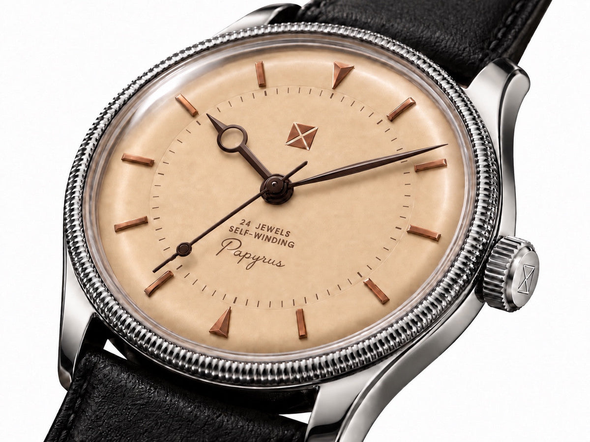
Cover image: Papyrus development render showing its formed dial, warm palette and finely knurled bezel.
A Cousineau watch should become more interesting when you turn it in your hand. The side of the case, the slope of the dial and the way an edge catches the light should contribute as much as the view straight through the crystal.
The design philosophy comes down to five principles: depth, sculpture, light, texture and restraint. They work together. A recess creates a shadow. A polished bevel makes a curve readable. A quiet surface gives a more unusual detail room to exist.
These principles guide my watches in development, including the examples below. They give each model its own character while keeping the experience of wearing it at the center of the design.
Depth: give the dial a physical shape
Depth is the starting point. A dial can have a floor, a wall, a slope and a recessed center. Applied markers can sit above it. The crystal can complete the space around it. Those relationships should remain convincing when the watch moves away from the exact angle used in a render.
Papyrus makes the idea especially clear. Its pie-pan geometry is meant to be physically formed, with a calm center and a distinct change of plane toward the perimeter. Getting that break right matters more than adding another decorative feature.
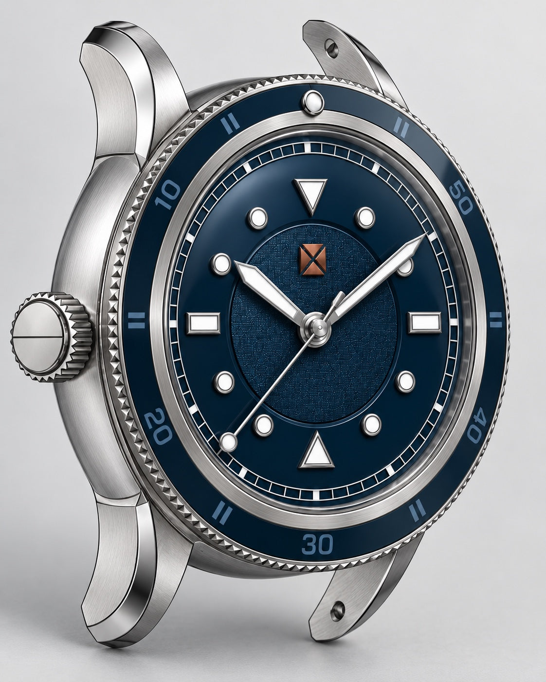
Outrigger approaches depth through a sloping chapter ring and recessed center. Neptune uses separate moving display elements. They arrive at very different faces, but all three depend on a real relationship between surfaces at different heights.
Sculpture: the case has to hold your attention
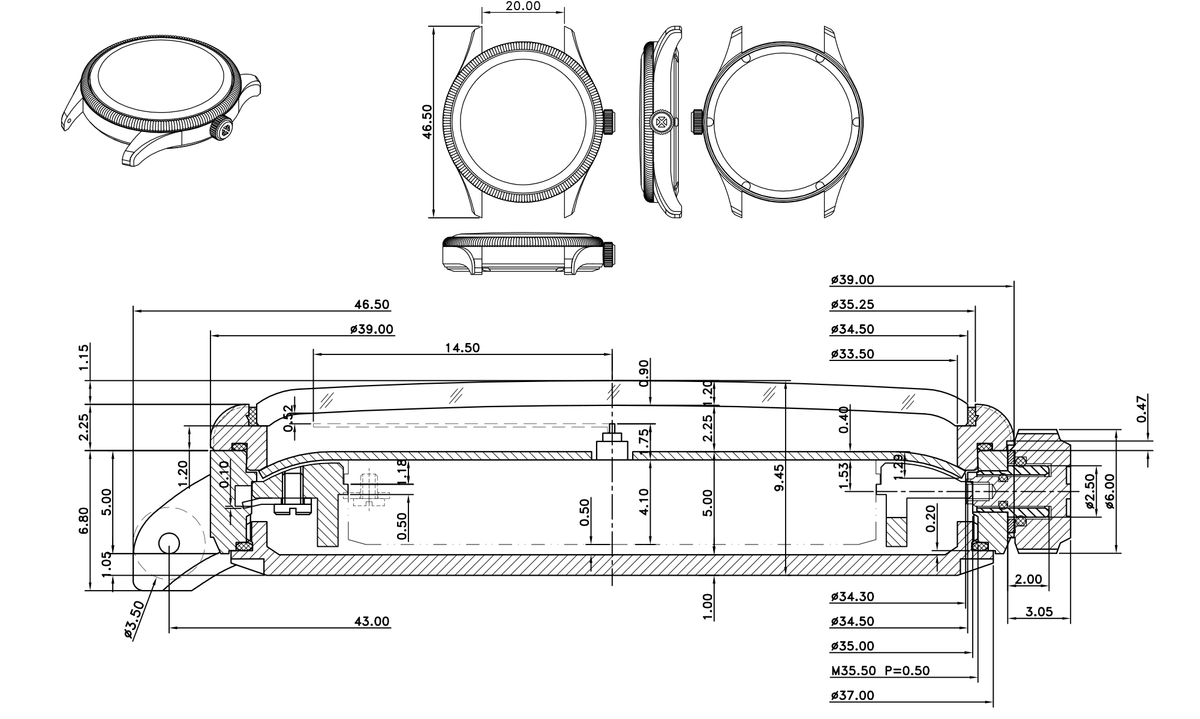
The case deserves to be considered from the side, underneath and between the lugs. A rounded or pebble-like body can have firmness without becoming sharp. Lugs can curve into the wrist while still having a recognizable shape. A narrow polished chamfer can clarify where one surface becomes another.
Diameter alone says very little about that experience. Thickness, lug reach, curvature, caseback shape and the first bracelet links all affect how the object sits. A watch can look compact from above and still feel awkward in profile.
I chose to develop two field watches with different personalities: rugged Outrigger and a more architectural, sleek Meridian. Their distinct silhouettes give the wearer a genuine choice while sharing the same interest in depth and sculptural form.

Light: the finish has to work as the watch moves
Finishing gives the geometry a voice. Brushed surfaces establish the broad form; a controlled polished edge can describe its boundary. A faceted hand or marker can change from dark to bright as the wrist turns. The effect should reward movement rather than depend on one carefully arranged photograph.
Color belongs in that discussion too. Warm parchment and antique-copper-toned details give Papyrus a different temperature from the blue fields and steel case of Meridian. The intention is specific to each watch. Warmth does not require covering every surface in a warm metallic finish.
Voyager II’s current dial direction combines a glossy outer field with a restrained linen-textured center, separated by a physical groove or step. The contrast gives light two different surfaces to travel across, revealing more of the dial as the wrist moves.
Texture: put it where it does something
A texture should help explain the object. It can mark a transition, give a surface a particular response to light, or create a tactile reason to notice a detail.
Outrigger’s current case brief calls for parallel grooves machined into the exposed flank panels, with bare metal inside the grooves. Their depth and spacing are meant to create the effect through light and shadow. The machining is part of the case’s expression.
Papyrus uses a finely knurled bezel against the quieter dial. Meridian’s current render places a textured blue numeral field around a smoother, circularly brushed center. The useful question is how those surfaces relate. Repeating a conspicuous texture everywhere would make the individual decisions harder to read.
Restraint: decide what gets attention
Restraint leaves room for a watch to be unusual. Neptune’s display is the central idea, so the surrounding elements need to help the eye understand it. Papyrus asks for a quieter balance because its dial geometry, bezel and proportions already carry so much of the design.
Hierarchy matters. The wearer should be able to distinguish the time display, the supporting information and the detail that can wait for a closer look. Typography, marker size, hand length, color and empty space all participate.
One of the most useful questions is what can be removed. If a flourish repeats something the case, dial or hands already express, the watch may be stronger without it.
A maritime influence that earns its place
There is a maritime thread in Cousineau: instrument-like dial architecture, harpoon-derived hand shapes, warm and cool material contrasts, and objects designed to feel purposeful in the hand. It is an influence on form and use. It does not require an anchor on every dial or a literal nautical illustration.
The practical side has equal weight. A crown should be pleasant to operate. A bracelet should follow the wrist. A case should sit comfortably. Those touchpoints are what make an instrument-inspired watch satisfying through an ordinary day.
The final check is the whole watch
The five principles feed a broader scorecard: proportion, depth, restraint, identity, wearability and purpose. Does the watch feel balanced? Could it be recognized without reading the name? Does every material and feature belong? Would removing a detail make the rest clearer?
That is the work connecting Papyrus, Neptune, Outrigger, Meridian and the other Cousineau projects. Each can have its own character. The shared standard is a considered physical object whose geometry, finish and small decisions continue to hold your attention after the first look.
Follow the watches as they develop
Join the Cousineau watch update list for development news and availability updates.
Get watch updatesFirst published October 6, 2026. Expanded October 6, 2026.